


Meanwhile #131
The sun is shining, birds are chirping, ice cream vans are jingling, and here I am cutting and pasting hyperlinks into my computer so that you can be entertained for a few minutes.
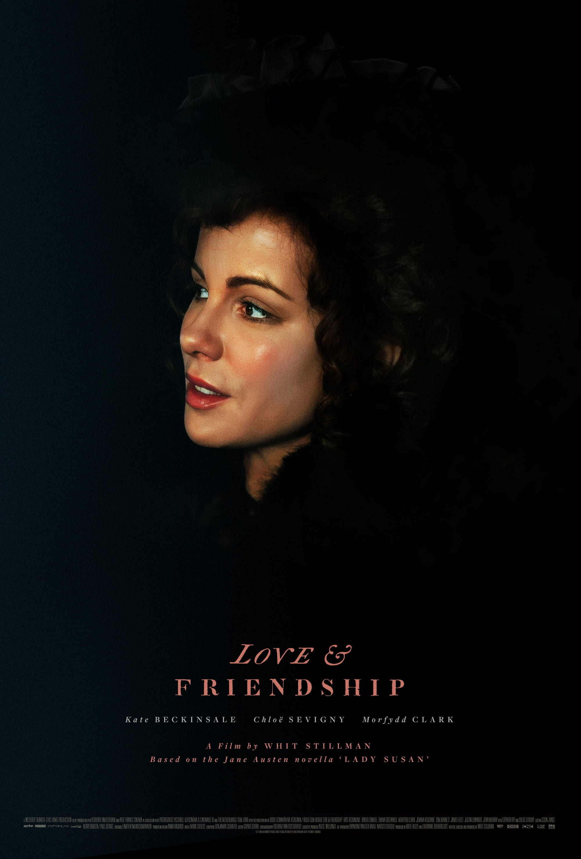
1 — Last week I finally watched Whit Stillman’s 2016 film Love & Friendship (based, a tad confusingly, on Jane Austen's Lady Susan rather than Love & Friendship) and my word it is rather good – and funny. Kate Beckinsale is particularly glorious. So anyway, I showed my appreciation by designing a poster for it. As you do.
2 — My first creative role (at Revolution Software) involved wandering around York, taking laughably low-resolution photos of old walls and rusty old boats for use as in-game textures. Things have moved on somewhat – here Kristóf Rosu talks about the photogrammetry workflow used for creating three-dimensional photographic scenery for Sniper Elite 5.
3 — Tim Easley’s sleeve artwork for Modified Man, sculpted entirely out of plasticine, is quite something. Apparently it took around 80 hours to complete! Just imagine the smell of it.
4 — I’ve linked this before, but it’s fab enough to share again: Google’s street view camera taking photos of itself in mirrors. Strong “Tarantino pottering around his house” vibe. WITH ROBOTS.
5 — Window-shopping for prints on the Condé Nast store while watching Love Island (this is very much how I roll), I came across this batch of seventies/eighties New Yorker covers by artist Gretchen Dow Simpson. Sublimely serene … imagine Edward Hopper and Adrian Tomine going away for a a nice weekend getaway by the seaside.
6 — Brandon Schaefer tweeted this earlier; John McConnell on designing book covers for Faber and Faber: “Every sales director wants to know if they can have the title bigger. So I say, ‘The book is only six inches wide and you cannot get it any larger. I've blown it up as big as I can. I simply cannot get it any bigger.’ But what they really mean is, ‘Can you make my book stand out more in the shop?’ Nothing stands out in American bookshops because they treat every book as a product in its own right they're all screaming so loud. They have their volume knobs turned up full blast. So when you look around, it's a blank-out, you see nothing. The trick is to go the other way.”
7 — Absolutely not going the other way: Dave McKean has illustrated the Folio Society’s new edition of The Gormenghast Trilogy, creating 142 artworks for Mervyn Peake's pioneering work of fiction. And boy are they pretty. These books will always look like Ian Miller in my mind, but this may very well change that.