


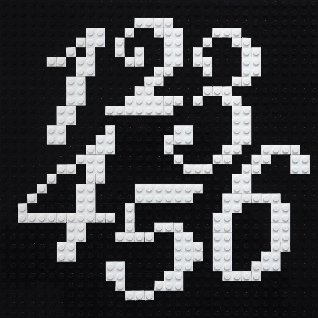
Meanwhile #120
Welcome to the first members’ edition of Meanwhile! First of all, thank you loyal reader for subscribing – it allows me to continue what I’m doing here and affords me time to pester incredible creative folk about their work. The more the merrier, so if you want to tell every single person you know about Meanwhile membership, repeatedly, aggressively, that’d be swell. Second of all … ON WITH THE PESTERING.
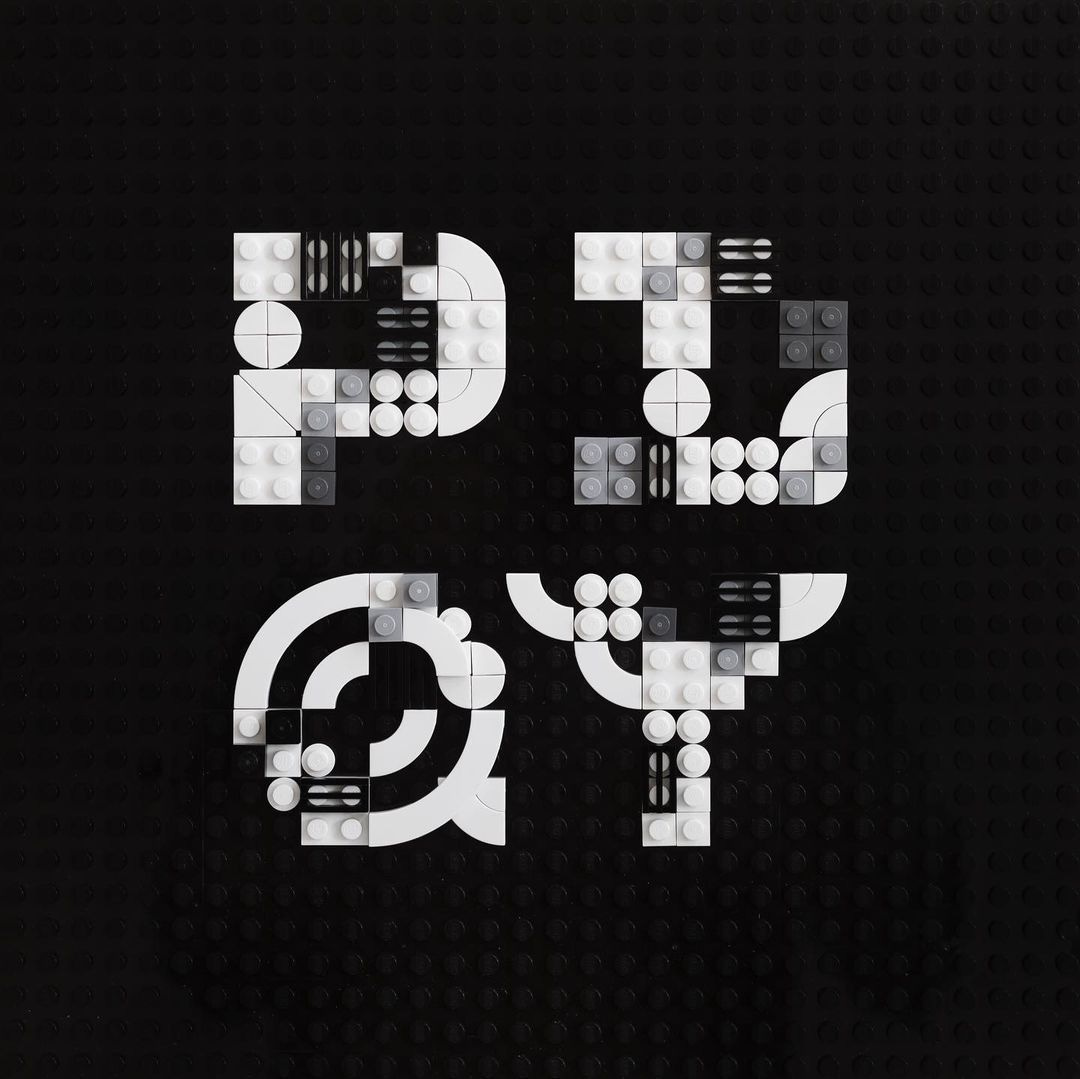
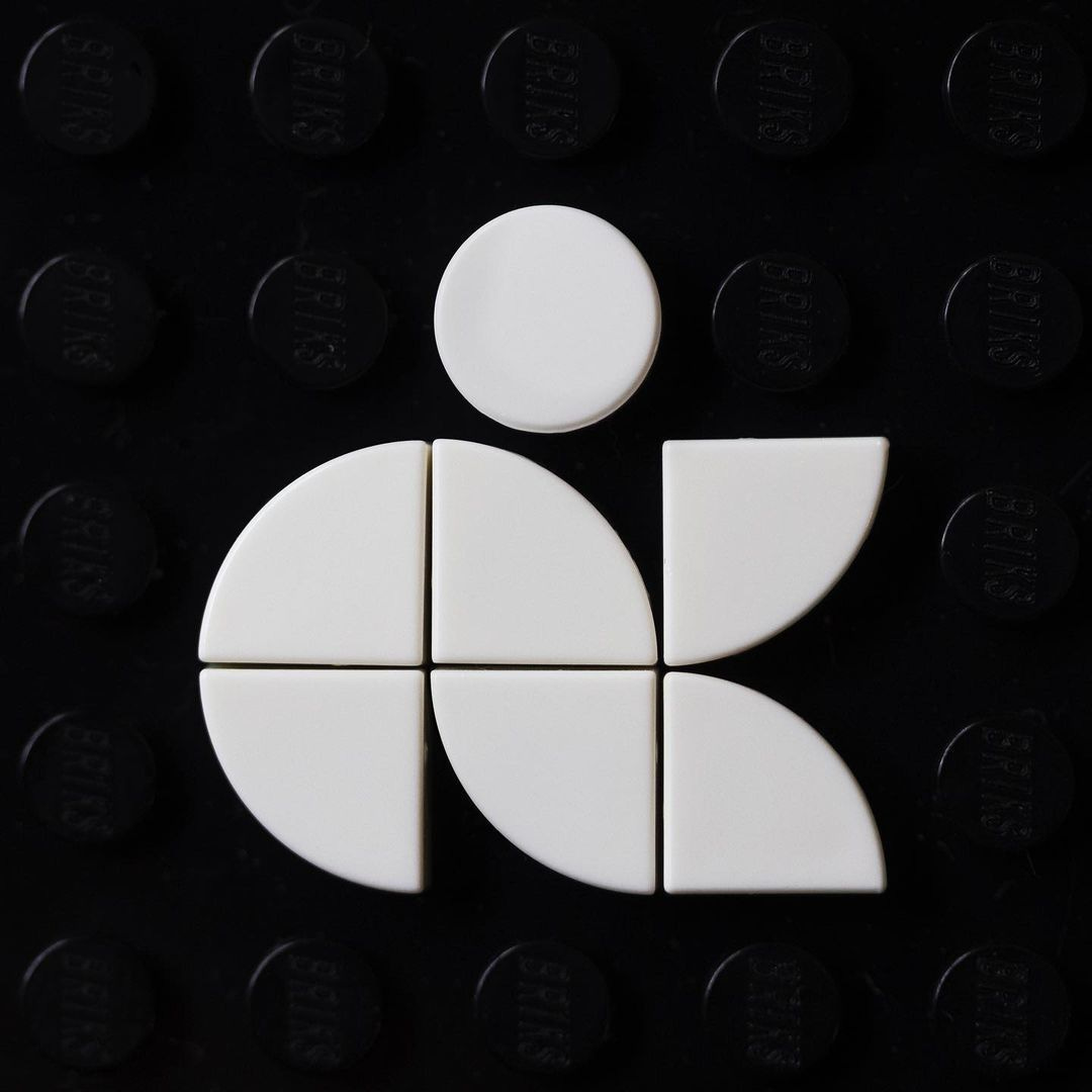
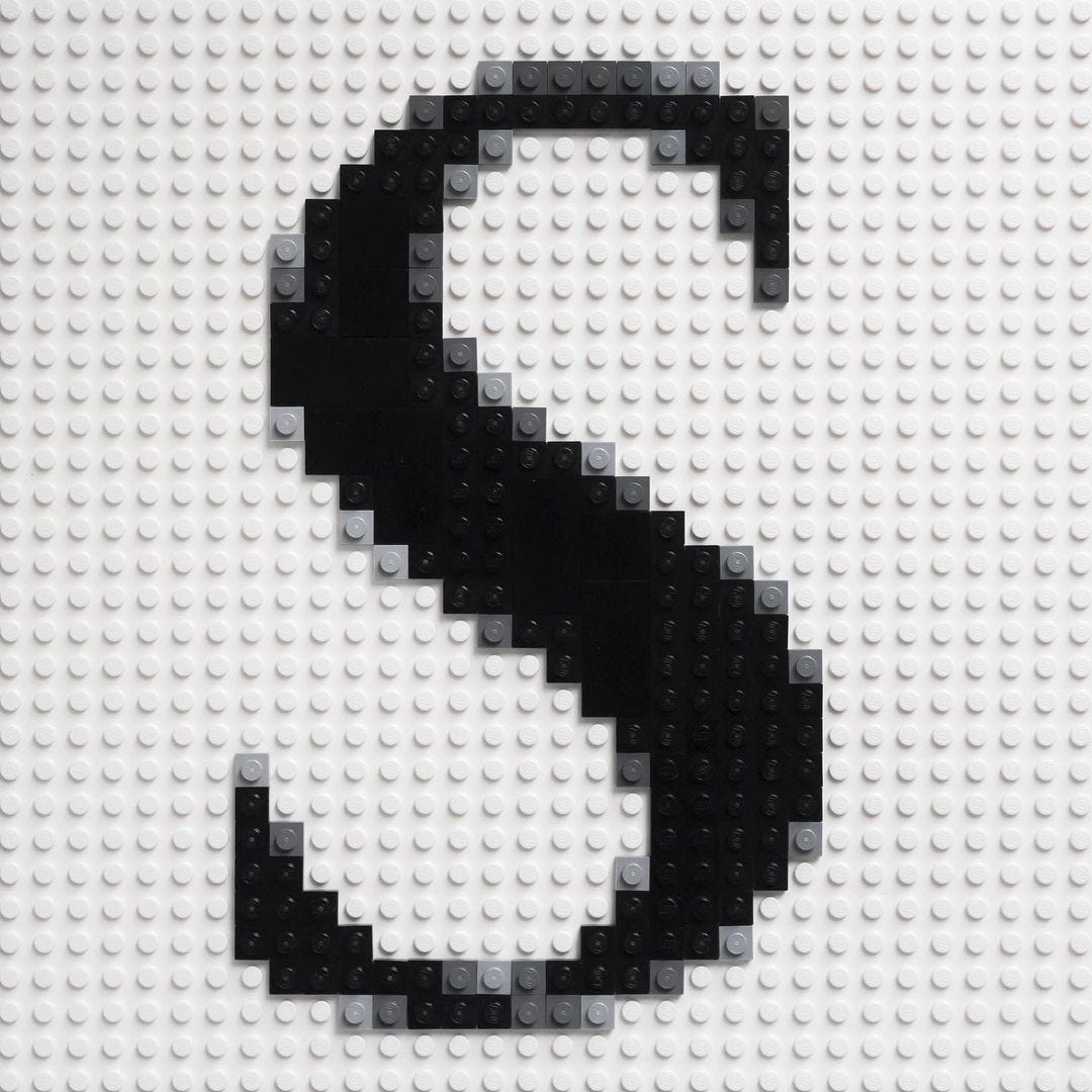
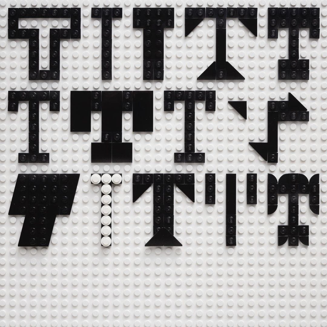
This week I caught up with British-born/New York-based designer Craig Ward, whose work I’ve admired for years – particularly his typographic experiments with bacteria with ferrofluid and light. Recently he’s been playing with LEGO, creating a series of studies that he's collected on his instagram account Brik Font. LEGO? Type? I must know more …
So how did this project come about?
My youngest daughter is in the process of learning to write, and I’ve always felt the way children are presented with alphabets is quite abstract in terms of one letter’s relationship to the next. As someone who works with and draws type a lot, I tend to think about how we arrived at letterforms in a different way to how it’s obviously taught to children, but when my eldest daughter was learning a couple of years ago she was enthralled when I showed her the ‘cheat code’ to writing letters, and presented her with a really simple grid that contained all the letters of the alphabet. Now my youngest is learning, I did much the same but with some LEGO we had in the house and, as someone who’s always enjoyed designing modular type, it struck me that I’d never seen any really good LEGO typography. That’s to say, I’ve seen type made of LEGO but it’s usually quite compromised and inconsistent, so I wanted to see what I could come up with. I’m surprised It took me this long to put the two together if I’m honest.
You say you’re on the quest for the perfect LEGO typeface – where are you on that quest? What valuable lessons have you learned?
I think I’m a way off declaring perfection(!), but there are definitely some favourites that are rising to the top. There are a lot of challenges that I hadn’t foreseen – curves joining at the centre of a B for example – but other aspects that have been surprisingly simple. I wanted to restrict myself to a relatively realistic/usable scale – I mean theoretically with a large enough baseplate I could realise a huge, perfectly antialiased italic serif – but the pleasure has come from working within whatever self-imposed restraints I set. Less, as ever, seems to be more, but there’s not much that can’t be conquered with some thought put against it.
Where do you get the bricks – are they from your existing collection, or do you buy them specifically for brikfonting?
Sourcing parts was a bit of an issue to begin with but I was also keen to really restrict myself to the basic constituent parts of a typeface – curves, straight lines, etc. I began by hacking (not really) a LEGO mosaic photobooth in the 23rd Street/5th Avenue LEGO Store in New York. I found out you can upload any image vs it taking your picture, so I uploaded a white-to-black gradient and it gave me an equal number of single studs in Black, Dark Grey, Light Grey and White, plus a nice large 48 x 48 grey baseplate to work with, so that was a solid start to the collection. The rest I sourced from secondary market sites like ToyPro.com and eBay. I actually only have a small plastic case of parts to work with plus a few different baseplates, it's not like I have a room of LEGO as a couple of people has asked online.

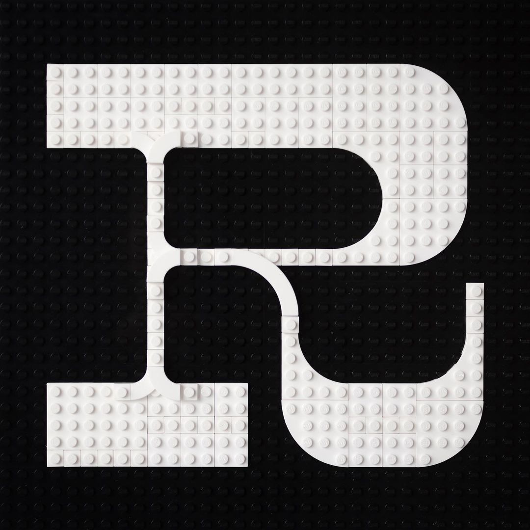
Where do you even start? How do you decide upon the dimensions of each typeface? Can you now just look at a typeface and think, “well that’s going to be a seven-studder”?
So, 7 studs has actually turned out to be a key number. 5 x 3 is theoretically all your need to create an uncompromised alphabet in upper and lower case but if you can hit 7+ studs high then you have infinitely more options; you can vary your stroke width and easily incorporate serifs etc., plus it allows you to have a lot more character in the typeface. In general I just start with an Illustrator doc that I created that contains all my parts and a baseplate, everything snaps to the grid and I can experiment with that very easily. It’s helpful when I need to work out layering etc. and saves having to unpick a dozen bricks when I realise something isn’t going to work a few letters in.
The antialiasing is particularly impressive – is that all done by eye/hand, or do you use computer to guide you?
A bit of both. I start by creating a Photoshop files of whatever resolution my baseplate is – say 36 x 36 pixels – and then choose a character to work with and experiment with different levels of antialiasing. You then need to posterise the image to just 4 levels – as I only work with black, white and two greys – and from there I’ll need to make some decisions if a brick looks too light or too dark.
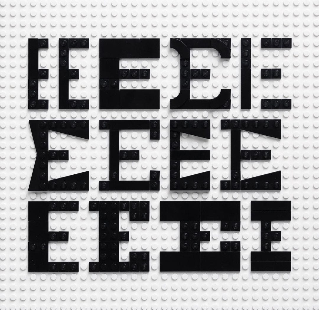
I imagine Bauhausish modular type is perfect for this sort of thing. Are there any particular styles you’ve found translate particularly well?
Absolutely on the Bauhaus type - I did create a Joself Albers inspired study and it was really successful. Pixel fonts are obviously your friend, they can ported like for like, and slab serifs seem to work really well too.
Have there been any particularly impossible characters?
More or less as you’d expect – anything that deviates from straight lines immediately poses a challenge, but it’s there to be solved. Ampersands are particularly tricky.
Have you tried printing with them? How do they take ink?
I did a couple of quick tests, printers ink goes on okay actually, and I’ve letterpressed with some polymer plates before, so I knew that wouldn’t be an issue. What is a problem is moving flat plates with stud plates. The LEGO Dots system bricks are nice and smooth, as are some finishing plates, but a lot of others I’m using have studs so that will limit what – if anything – I’m able to print.
Do you know of anyone else doing this sort of thing? Have your builds inspired others?
I did a little search online before I began to make sure I wasn’t going over old ground but I wasn’t hugely impressed by anything I found, really because the people doing it weren’t coming from a design background (for the most part) and there were inconsistencies and compromises in the type, and I wanted to avoid that where possible. A few people have shared their creations and tagged me with them online; a university in Chicago is also running a modular design type project inspired by it and I'll be jumping in as guest critic on that. It's had a much warmer reception than I'd anticipated actually, the Instagram following quickly surpassed my one personal account that took me 11 years to build!
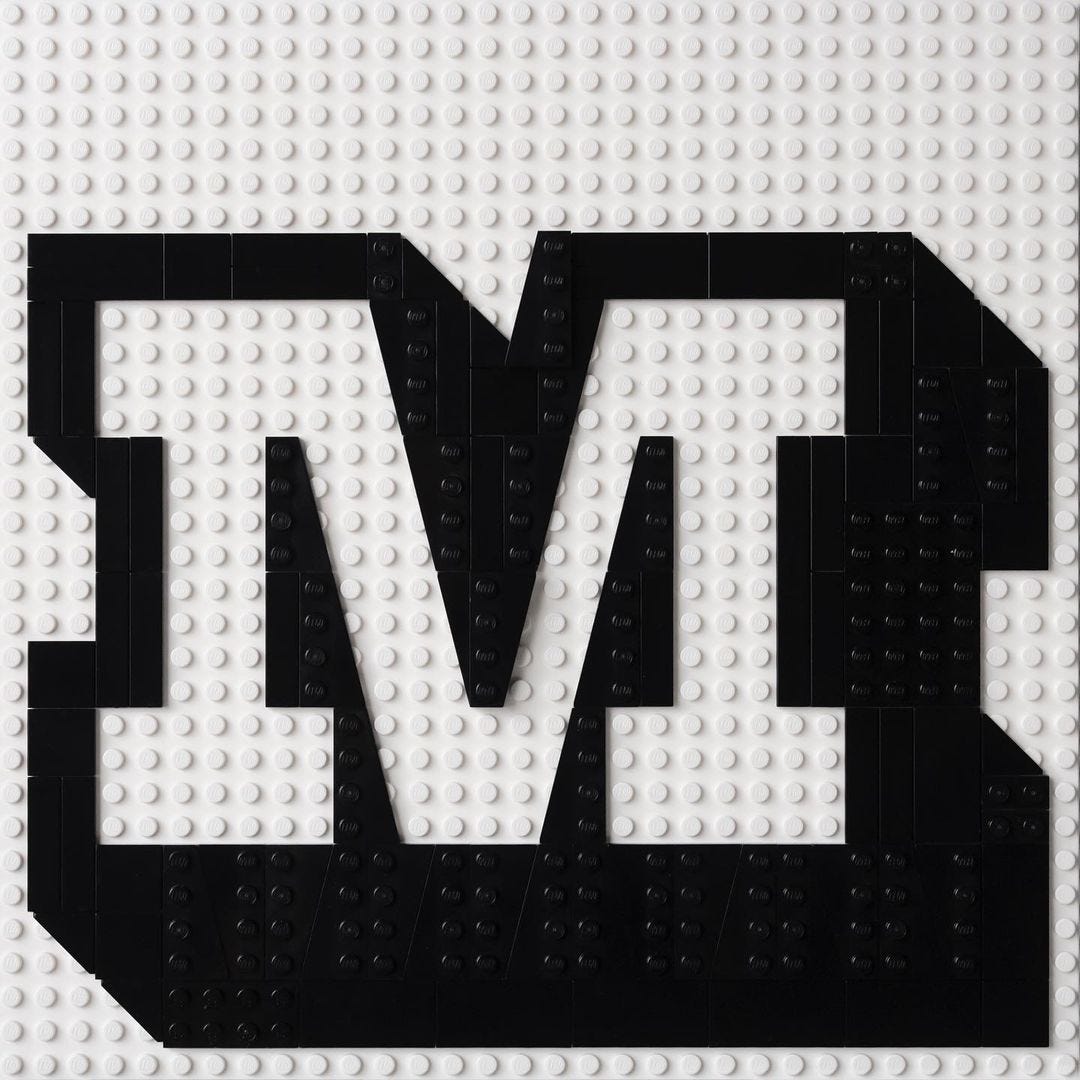
What’s been you most satisfying build so far?
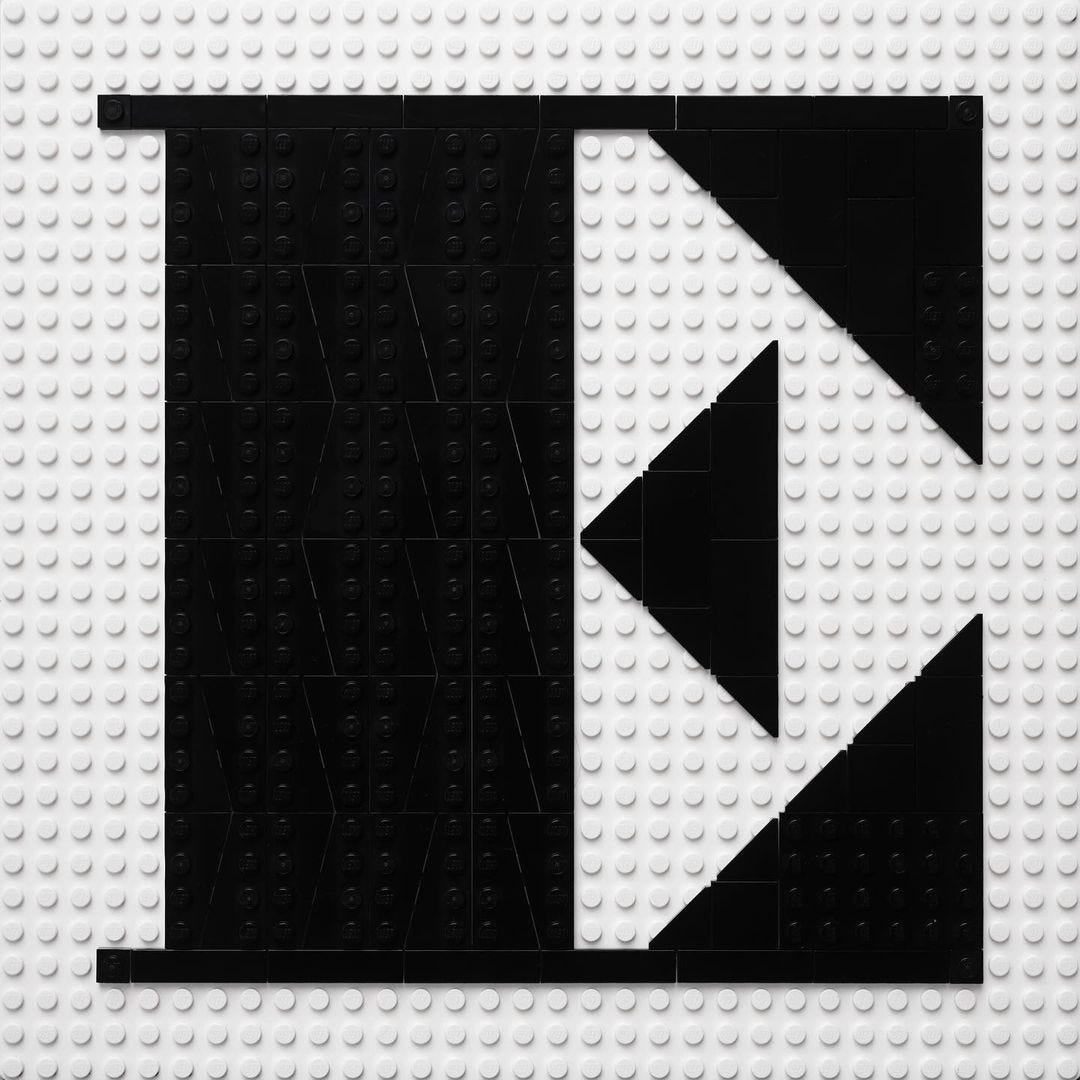
I think a large extruded slab serif M that I created was a real ‘oh, yes’ moment. It doesn’t feel compromised at all, even with the differing stroke widths in the diagonals.
The presentation of your builds on instagram is lovely. How tricky is it photographing the finished pieces? I imagine getting the grids to line up just so is a bit of a headache … ?
It is an actual headache. It turns out shiny little bits of plastic are really hard to photograph well; and as we’re in the middle of moving house, I’ve been unable to have any real consistency with photographing them, so there’s been a fair bit of levels work. In an ideal world I’d rebuild them all and shoot them at the same time in a controlled environment but that would require infinite money and pieces.
Finally, where is this project going … or rather, where would you like it to go?
It’s going – I think – towards a book of alphabets. I have a large collection of type sample books and lettering sample books and I think this would be a nice place to document the project, and perhaps even serialise it if enough people were interested in it. Definitely a passion project either way and will have to work alongside actual work! In the last couple of weeks LEGO have announced their own sign-maker kits so, I think there’s probably a cross-over market of design nerds and at-home builders that would like to see what was possible within the medium. I have pitched a deck at a couple of people at LEGO directly, but haven’t had any traction yet so it’s likely I’ll do a Kickstarter once I’ve made some progress on it.