Hello, hello. Hope you’re all well. Yes? Yes. Good. Without further ado – arguably the worst kind of ado – here is a list of things.
1 — Jolly nice way to start the year, finding myself on PRINT’s Twelve Creative Voices to Following 2024 list. In some great, humbling company there.
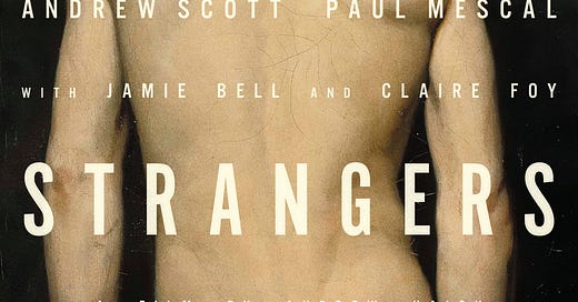
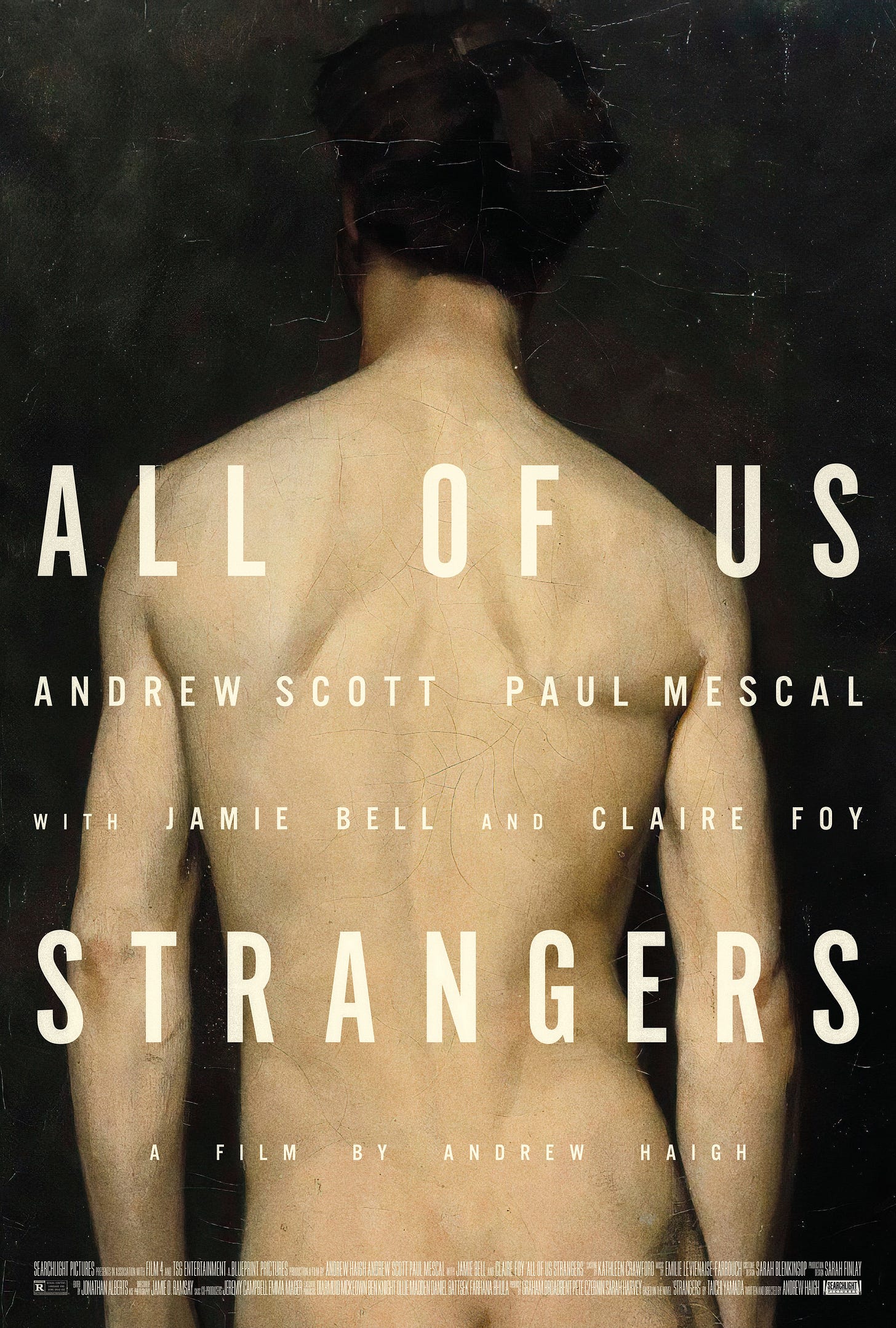
2 — Dr B and I found a rare gap in the work/work/school schedule to go to the flicks, and had a very nice time completely bawling our eyes out at Andrew Haigh’s All of Us Strangers. Once I’d recovered, I made this poster for it (with an 1874 Albert Edelfelt painting standing in for Andrew Scott) because why not:
3 — I’ve found one of the best things about AoUS is the writing going on around it. This write up from John Grindrod is particularly lovely, and I once again find myself nodding along to Guy Lodge.
4 — Can’t stop looking at Lee Friedlander photos. His use of frames within frames (windows, doors, mirrors, television screens) – an additional layer of mystery about what’s happening inside and outside the image’s border – very much appeals to the rectangulist in me.
5 — These unused posters for Kubrick’s Eyes Wide Shut are creepy as heck, and therefore perfect. Surprised they’ve not been reused for rereleases or anything.
6 — Website updated! Have downgraded from Squarespace 7.1 to the arguably superior 7.0. If you’ve yet to dabble in Squarespace, be aware that that version numbering is exceedingly misleading – they’re essentially two completely different platforms, with very little in common.
7 — Science fact: 10am and 4pm are the best times to watch a movie. GERWIG HAS SPOKEN.
8 — Really rather tempted by these postcard model kits. Love the buildings they’ve selected, especially the wonderfully plain snooker hall and the coastal gothique Hastings net huts. Is coastal gothique a thing? Should it always be italicised? Who knows.
9 — Seeing lots of great work from GrandSon recently. Loving their Longlegs posters. Apparently there’s a cracking trailer as well, but I’m avoiding it as I’m already sold.
10 — Loving Patrick O’Keefe’s deep dive into the character-based production design of Across the Spider-Verse, specifically on creating the expressive, chromatic world of Gwen Stacy. Would love to see some of this on Nimona, for my money the best animated film of the year.
Okay, that’ll do. Find me elsewhere, on threads, twitter, instagram, etc.


